
Since, I have two separate themes I've decided to show you my rooms in two separate blog posts. This is the final product at School One.
At school one, I went with a sweet treats theme. I started by decorating the wall in the back of my room. It isn't tack-able, but it is ugly and warped. The wood has lots of scratches and chips in the paint. It is also one of the FIRST things you seen when you walk in the room. That is why it just has to be covered. The finished product is two 'bulletin boards'. The first one is one designed and created by me:
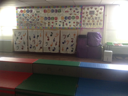
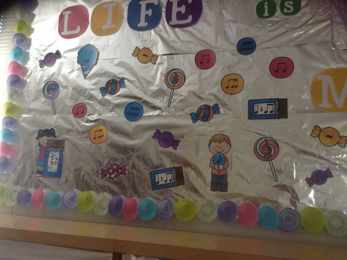
The background is aluminum foil, the border is cupcake liners, and it reads LIFE is SWEET in MUSIC CLASS. I used Wake Me Up font from KG Fonts and clip art from Whimsy Clips with music notes added to them. I absolutely LOVE the way this turned out and it really catches people's attention.
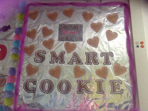
The second 'bulletin board' also has aluminum foil as a background, but then uses tulle as a border. (Tulle was on sale for less than $1 a yard, so I just HAD to get some) The bulletin board reads "MUSIC Makes me a SMART COOKIE". You can purchase this bulletin board from Cara at Miscellaneous Me.
My side wall is a giant temporary wall, so it is entirely tack-able. I covered it with four bulletin boards.
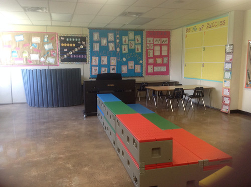
First, "A Recipe for Great Singing" bulletin board from Treble in the Music Room. I also purchased the same clip art, so I could fill in some of the spaces. You can purchase the clip art she used HERE.
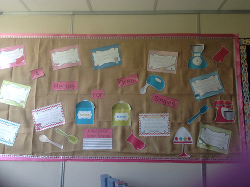
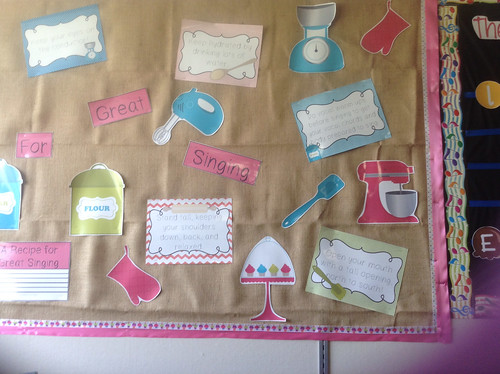
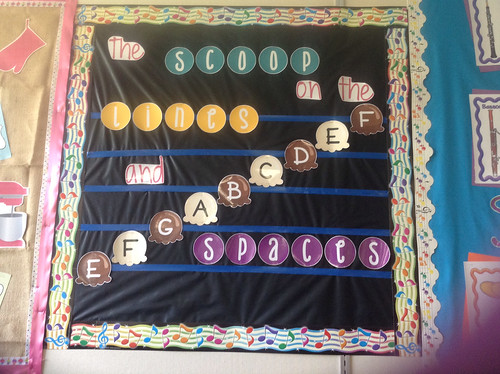
Second, "The SCOOP on the LINES and SPACES" bulletin board. I created this bulletin board myself. It is not currently something for sale in my Teachers Pay Teachers store, but if you'd like to see it I may consider putting it there.
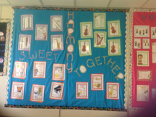
Third, "SWEET HARMONY TOGETHER" bulletin board is just a bulletin board of all my instrument family posters. You can purchase these posters in my Teachers Pay Teachers store - HERE.
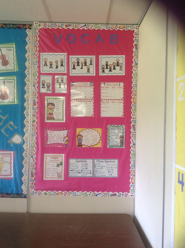
Finally, my vocab wall is more vocabulary posters from my Teachers Pay Teachers store.
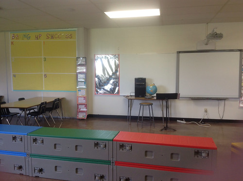
The front of my room has my classroom incentive chart. (You can learn more about that HERE.) The Baking Up Success bulletin board will be where I keep track of progress this year. After reaching the top of the chart each grade will have a cupcake added to their chart.
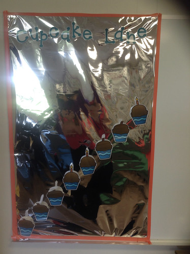
Cupcake Lane is made up of wrapping paper as a background with electric tape as a border. The cupcakes are held up with velcro, so I can switch them out. This is another item that is not currently for sale, but if I get requests for it I may add it.
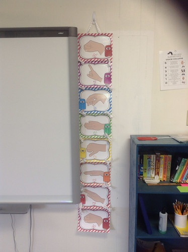
My hand signs poster is almost an exact replica of THIS FREEBIE in my shop.
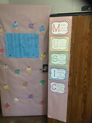
Then my door is sweet and simple with clip art from The Enlightened Elephant.
PHEW! Hope you enjoyed all of the pictures. If you liked this post, look forward to Part 2 with school number 2! (Updated: Click here to check it out!)
Great job, Brittany!! I LOVE the idea of foil backgrounds with this theme--but I can't even imagine how hard they were to put up! I also love your scoop lines & spaces board--GREAT idea to go with your theme!!! SUPER JOB!!! I know how hard it is to get two rooms ready when there AREN'T issues--you did a fabulous job!!!!
ReplyDeleteThanks so much Debbie. Surprisingly the aluminum foil wasn't too hard to work with. I got the idea from Cara Coffey at Miscellaneous Me. She gave that as a suggestion for the Music Makes Me One Smart Cookie. I bought foil to use for this bulletin board last year and thought it was going to be so annoying to work with I'd never use it again. However, it was just the opposite. I just cut and stapled like any other fabric. It was so simple I decided it wouldn't be too bad to do the whole wall with aluminum foil and it wasn't. :-)
DeleteOh my gosh! TOO SWEET! I love your aluminum foil backgrounds and cupcake paper borders. It really makes your display pop. Although...I must admit...your classroom makes me a little hungry! LOL. Thanks for linking up! I appreciate it!
ReplyDeleteHaha! Thankfully I'm not much of a sweet tooth, so I can look at it all day and have no cravings for sweets. Now if I decorated it with pretzels, chips, and salsa I would be going home and stuffing my face. :-P
Delete